


• A Weather App Redesign •

Project Overview
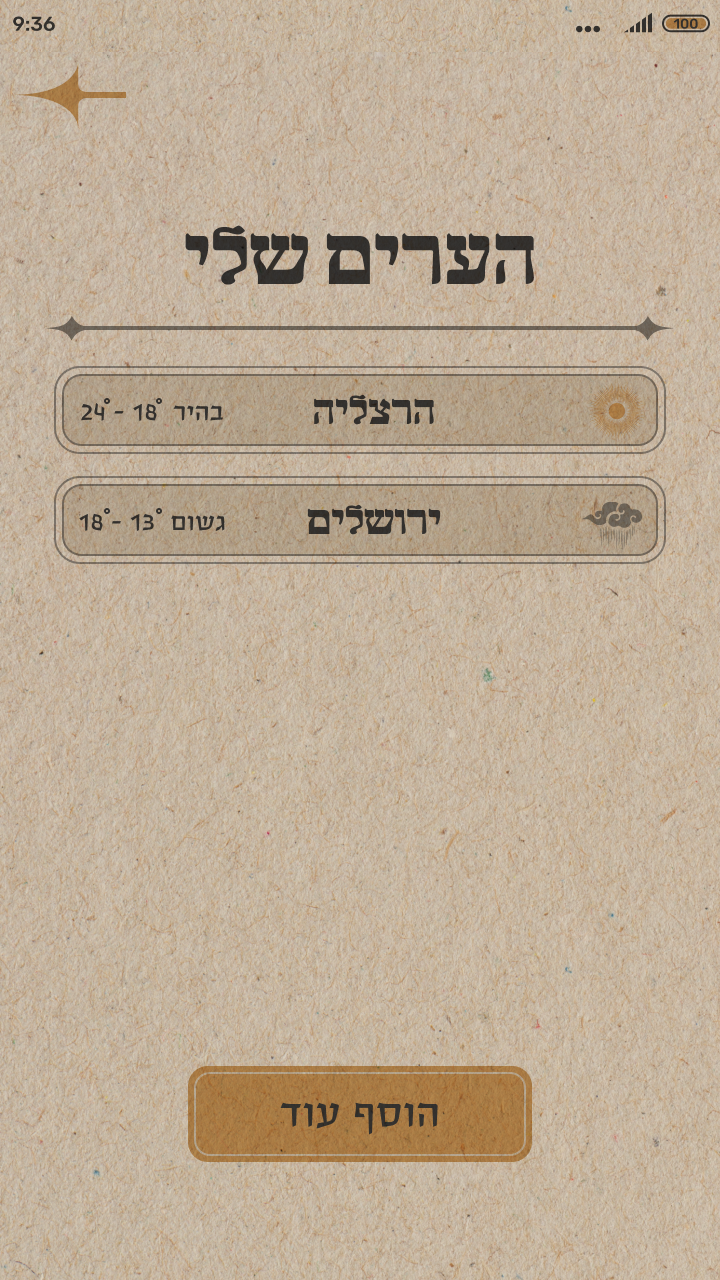
A redesign of the stock weather app, inspired by the visual style of Zeev Raban—a central figure in early 20th-century Israeli art. This concept merges Jugendstil (Art Nouveau) aesthetics with functional design, reviving antique Hebrew visuals to create a poetic, culturally-rooted experience. Alongside the app’s core weather functionality, I introduced a new feature: personalized hiking recommendations based on user preferences, encouraging users to explore the landscapes of Israel.
My Role
UX/UI Designer – Responsible for research, prototyping, final UI design, and the design of promotional posters reflecting the project’s visual identity.
Brief
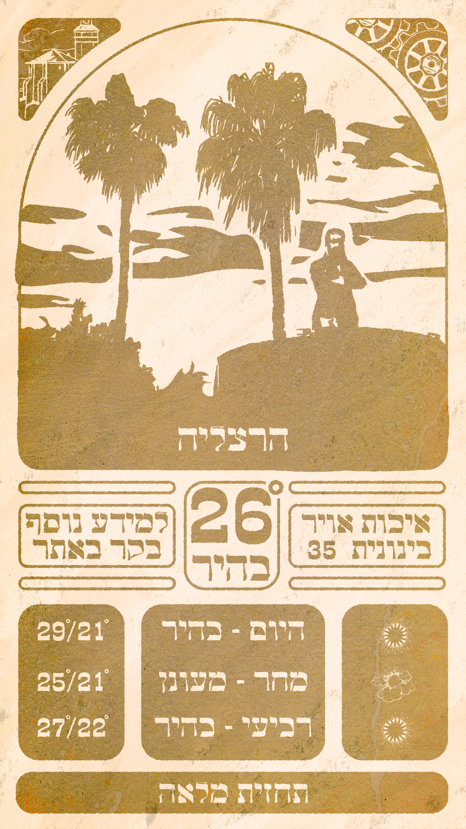
Redesign a common stock mobile app in the style of a well-known designer. I chose the Android stock weather app and reimagined it through the lens of Zeev Raban’s artistic language—integrating decorative elements, warm palettes, and a custom treatment that reflects the era’s aesthetic with a modern twist.

Source
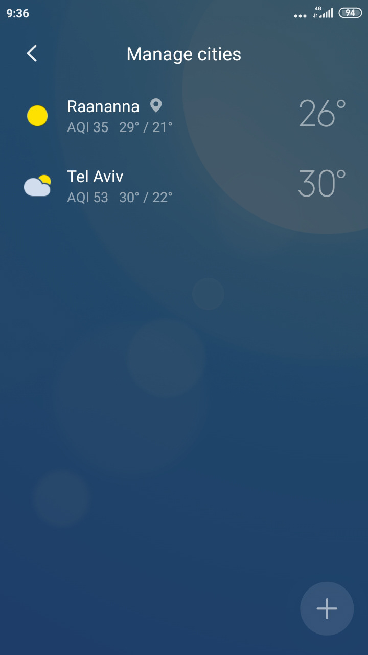
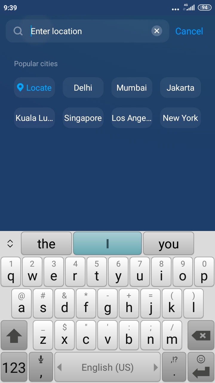
The original weather app offers basic weather data with a clean, minimal interface. It’s practical but lacks emotional engagement or aesthetic character. I saw an opportunity to elevate the experience by giving it a strong cultural identity.


Inspiration
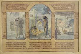
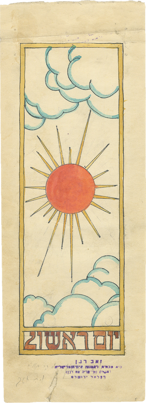
Zeev Raban’s works are rich with ornament, symbolism, and devotion to the Hebrew revival spirit. Influenced by European Art Nouveau, he incorporated Jewish themes and motifs into every detail—architecture, typography, and illustration.
My design draws from:
My design draws from:
• Curved lines and nature-inspired frames.
• Hebrew type influence.
• Warm, earthy tones reflecting local landscapes.
• Decorative flourishes echoing illuminated manuscripts and Raban’s iconic style.
• Hebrew type influence.
• Warm, earthy tones reflecting local landscapes.
• Decorative flourishes echoing illuminated manuscripts and Raban’s iconic style.


UX Integrity
I kept the existing UX mostly intact to preserve the familiar and intuitive user flow of the original weather app. My focus was on maintaining usability and legibility while elevating the interface through a distinct visual redesign. Careful attention was given to spacing, contrast, and hierarchy to ensure that the ornate style wouldn’t interfere with functionality.


Style Guide
• Typography: Inspired by early Hebrew revival fonts.
• Color palette: Desert ochres, forest greens, and Jerusalem stone hues.
• Illustration & Iconography: Art Nouveau-style frames and iconography.
• Layout: Framed with arcs, tactile, rich with visual texture while keeping usability clear.

I simplified Raban’s intricate illustrations into modern flat silhouettes, incorporating wavy light rays and architectural elements like stylized columns for decorative flair. The color palette was kept sandy and muted, with vivid accent colors added to highlight key elements and bring vibrancy to the design.


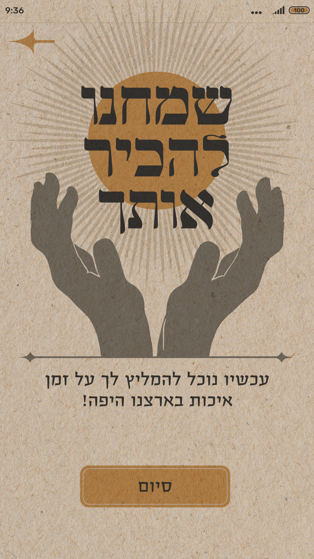
Added Feature
Hiking Preferences & Suggestions - This feature ties the app to Israeli land exploration—mirroring the Zionist movement’s emphasis on “knowing the land.”
Key Feature Elements:
• Quick Survey: Users input hiking preferences: trip length, terrain type, preferred days, etc.
• Suggested Hikes: Personalized list with beautiful illustrations and weather info
• Favorites: Users can save hikes for later
• Suggested Hikes: Personalized list with beautiful illustrations and weather info
• Favorites: Users can save hikes for later


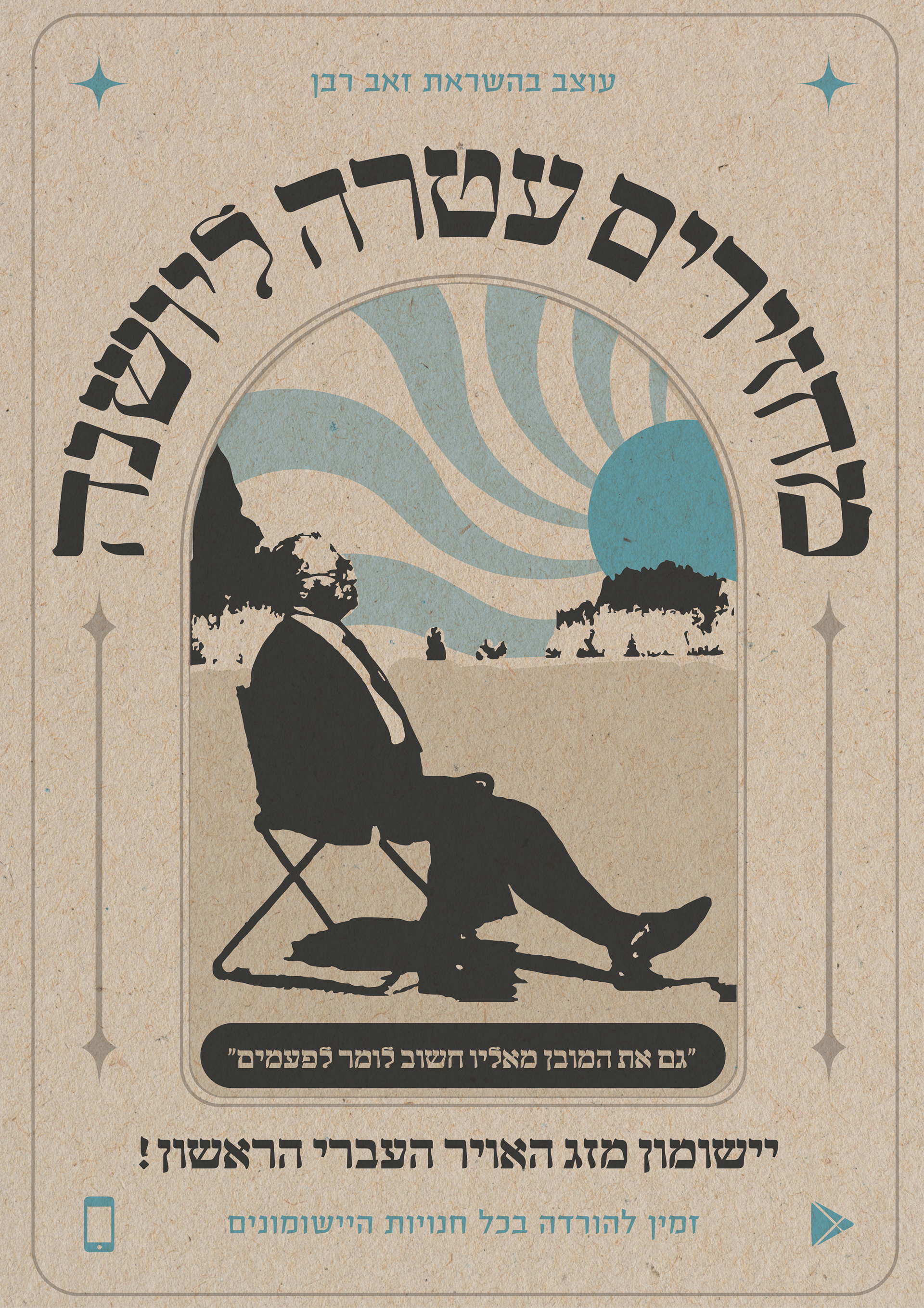
Promotional Posters
Designed vintage-inspired posters featuring compelling calls to action, incorporating quotes from influential Israeli leaders such as David Ben-Gurion, Theodor Herzl, and Menachem Begin, encouraging exploration of Israel’s landscapes. The posters reflect the app’s cultural and national focus, blending historical significance with modern design.


Outcome & Takeaways
This project helped refine my ability to balance style, content, and user needs within a mobile product.
• Blending art history with product design can bring new life to familiar tools.
• Adding a simple, meaningful feature like hike recommendations can shift the app’s purpose - from functional to inspirational.
• Working with cultural references deepens user connection, especially in local markets.
• Visual richness does not have to compromise usability.